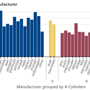
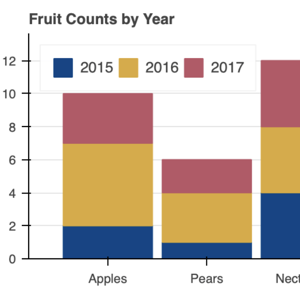
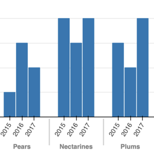
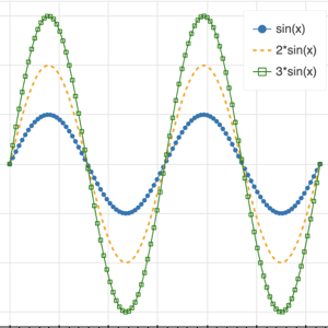
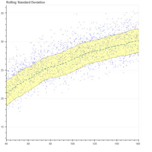
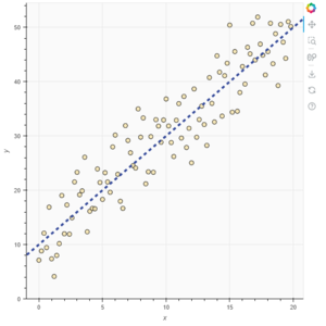
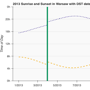
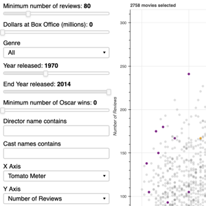
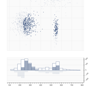
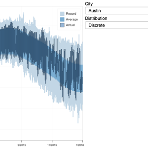
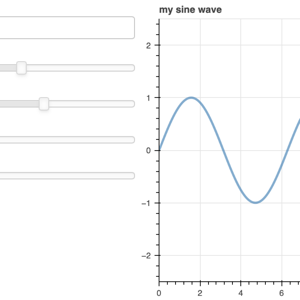
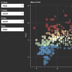
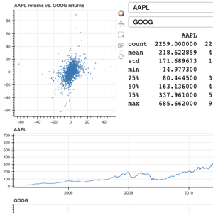
Gallery#
All of the examples below are located in the examples subdirectory of the Bokeh repository. Click on an image below to see its code and interact with a live plot.
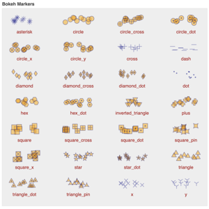
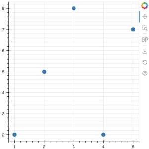
markers
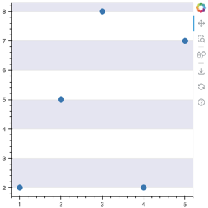
color_scatter
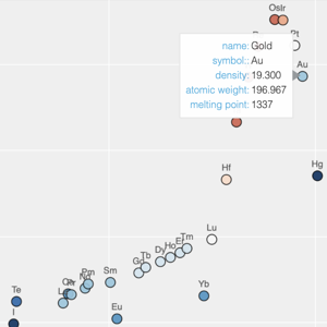
elements
image_url
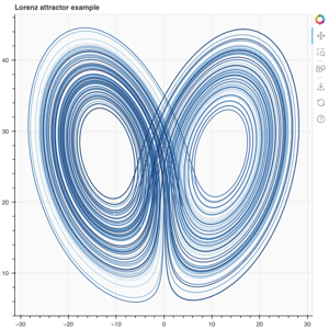
lorenz
linear_cmap
linear_cmap_colorbar
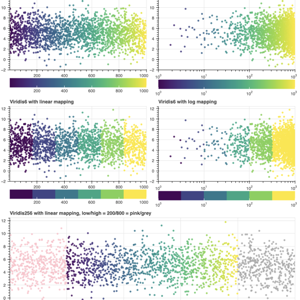
color_mappers
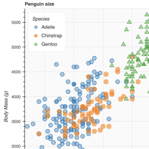
transform_markers
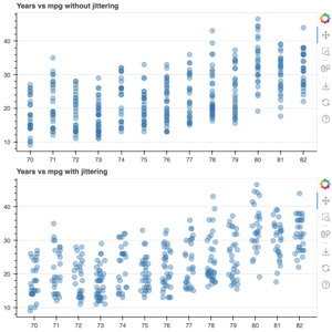
transform_jitter
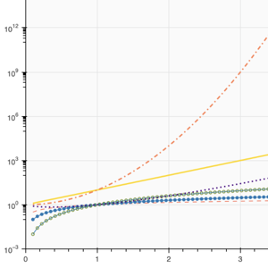
logplot
twin_axes
fixed_axis
basic
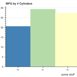
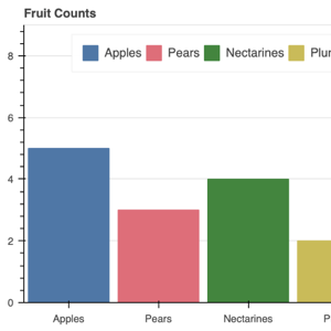
colormapped
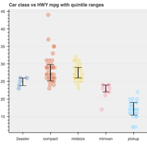
intervals
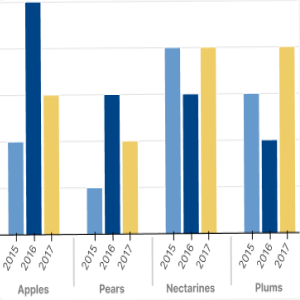
mixed
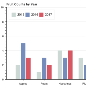
nested_colormapped
pandas_groupby_colormapped
pandas_groupby_nested
stacked
stacked_split
nested
colors
dodged
stacked_area
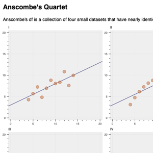
anscombe
legend
arrow
band
slope
span
whisker
colorbar_log
box_annotation
grid_bounds
minor_grid_lines
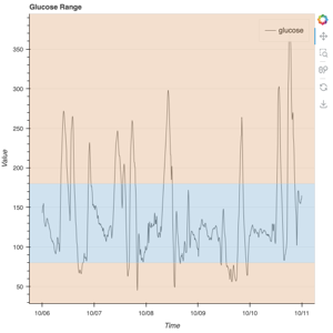
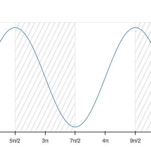
grid_band_fill
hatch_grid_band
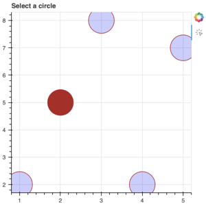
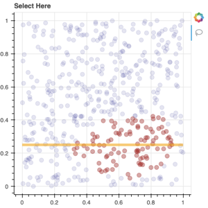
glyph_selection
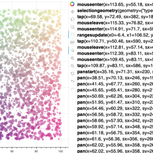
glyph_hover
legend_location_outside
legend_title
latex_blackbody_radiation
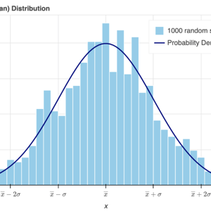
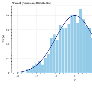
latex_normal_distribution
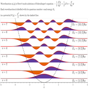
latex_schrodinger
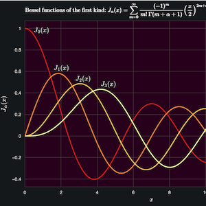
latex_bessel
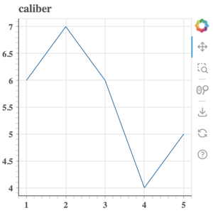
caliber
dark_minimal
light_minimal
night_sky
contrast
image_rgba
image
image_origin_anchor
contour_simple
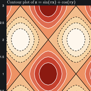
contour
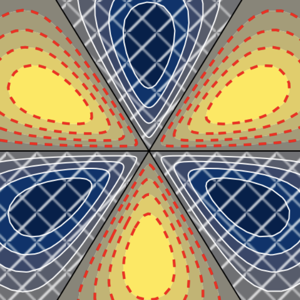
contour_polar

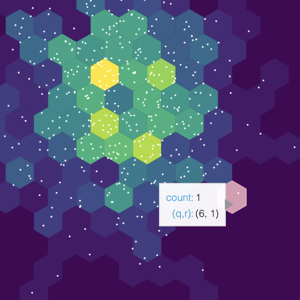
hex_tile
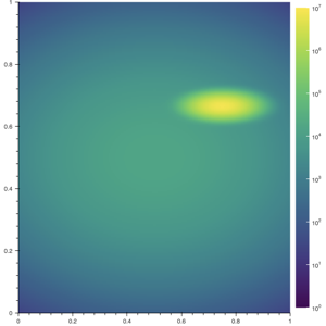
hexbin
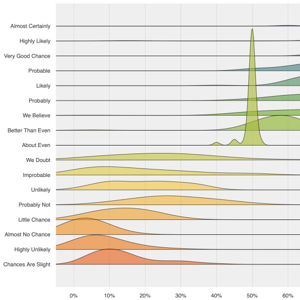
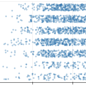
ridgeplot
scatter_jitter
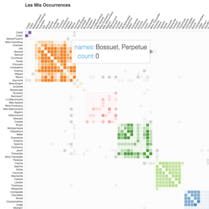
les_mis
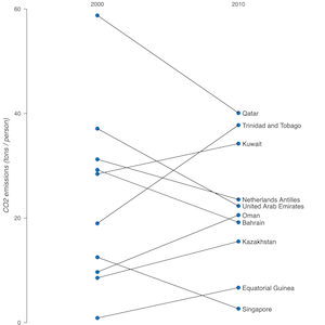
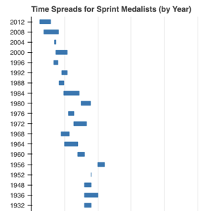
slope_graph
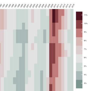
heatmap_unemployment
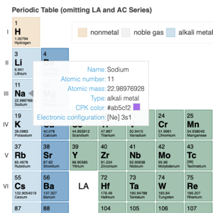
periodic
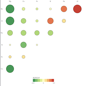
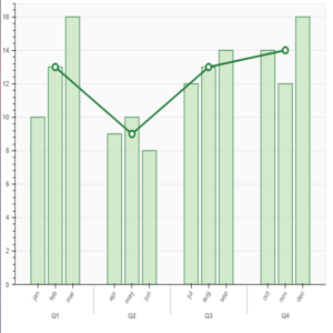
correlogram
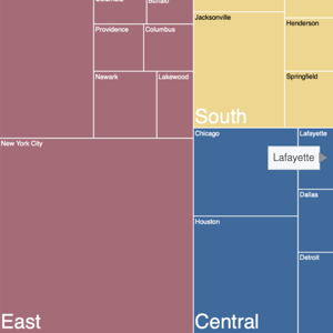
treemap
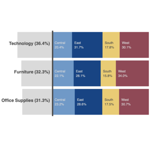
crosstab
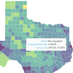
texas_hover_map
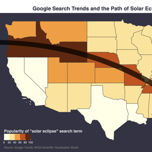
eclipse
tile_source
tile_xyzservices
tile_demo
gmap
from_networkx
node_and_edge_attributes
candlestick
missing_dates
pie
donut
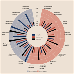
burtin
histogram
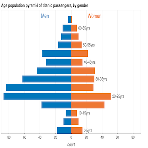
pyramid
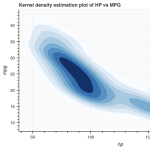
kde2d
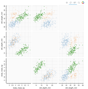
splom
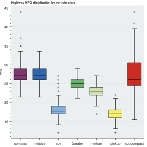
boxplot
sinaplot
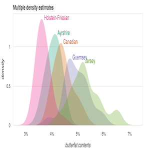
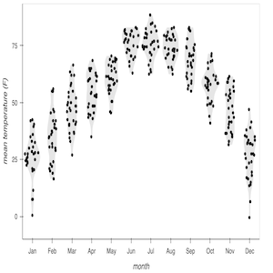
density
Bokeh has many interative tools and widgets. Only a subset have thumbnails here. For more information see the Interaction chapter of the users guide.
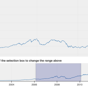
range_tool
linked_brushing
linked_crosshair
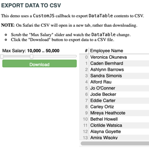
data_table_plot
legend_hide
legend_mute
slider
color_sliders
customjs_lasso_mean
js_on_event
multiselect
multichoice
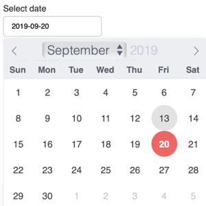
date_picker
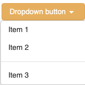
dropdown
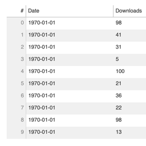
data_table
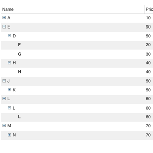
data_cube
The thumbnails in this section link to live demos hosted at demo.bokeh.org.
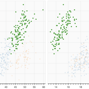
selection_histogram
Shows axis histograms for selected and non-selected points in a scatter plot. (source code)
sliders
A basic demo that has sliders for controlling a plotted trigonometric function. (source code)
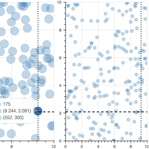
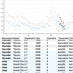
crossfilter
Explore the autompg data set by selecting and highlighting different dimensions. (source code)
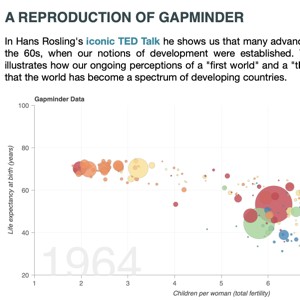
gapminder
A reproduction of the famous Gapminder demo, with embedded video added using a custom page template. (source code)
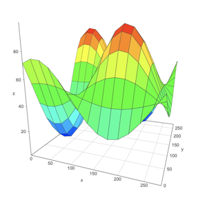
surface3d
An updating 3d plot that demonstrates using Bokeh custom extensions to wrap third-party JavaScript libraries. (source code)